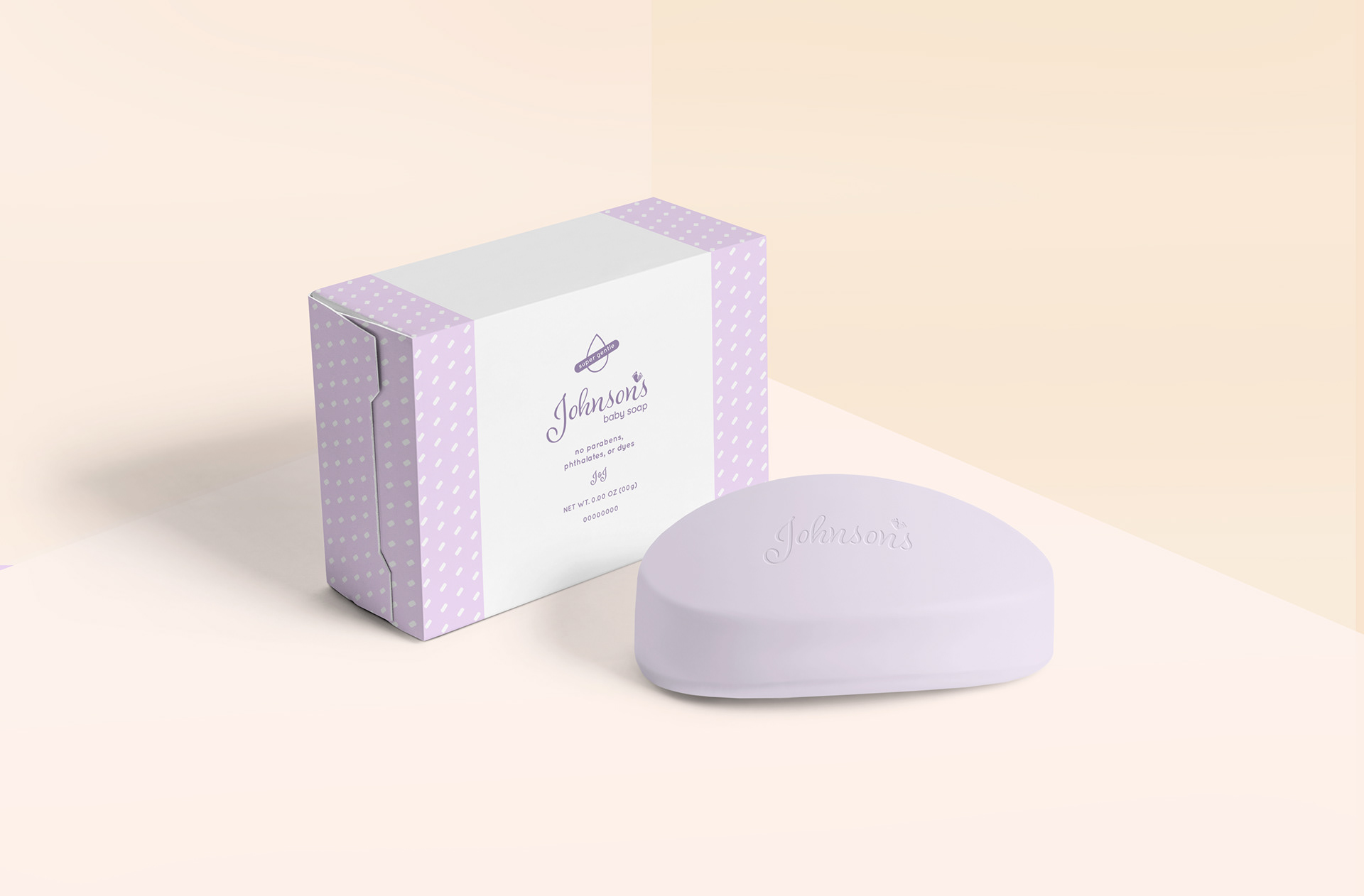
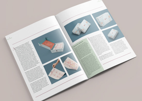
Product Rebranding (Spring 2020): ARTS446 Structures
Rebranding a famous brand that's well known in the market and has variety of products within the brand. Since this project was a group assignment, my team and I chose to rebrand Johnson's Johnson's, specifically the baby products. We did not want to change the brand's logo too far away from its original since it's so well known to the public. What we decided to do was to update it with a more contemporary typeface.
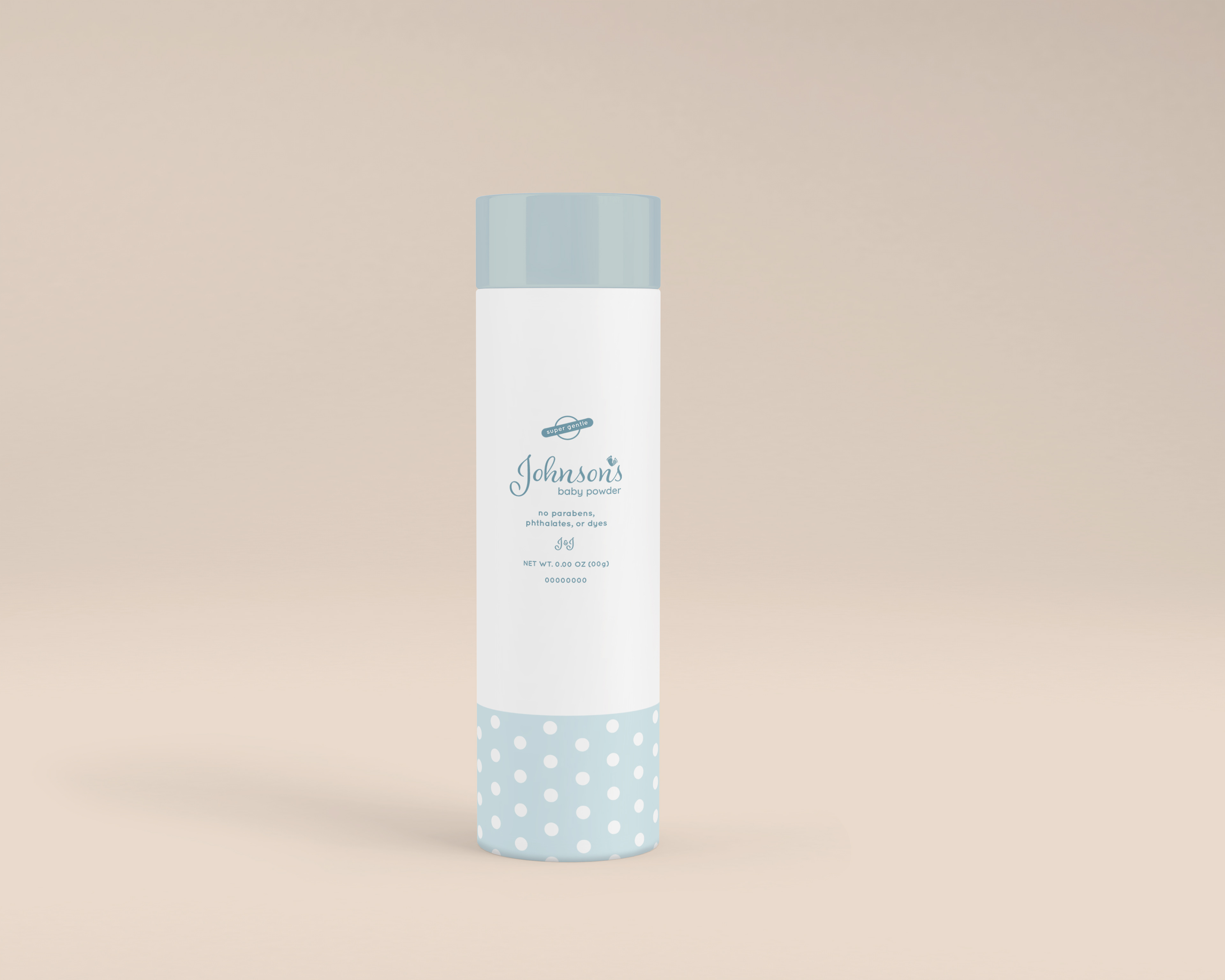
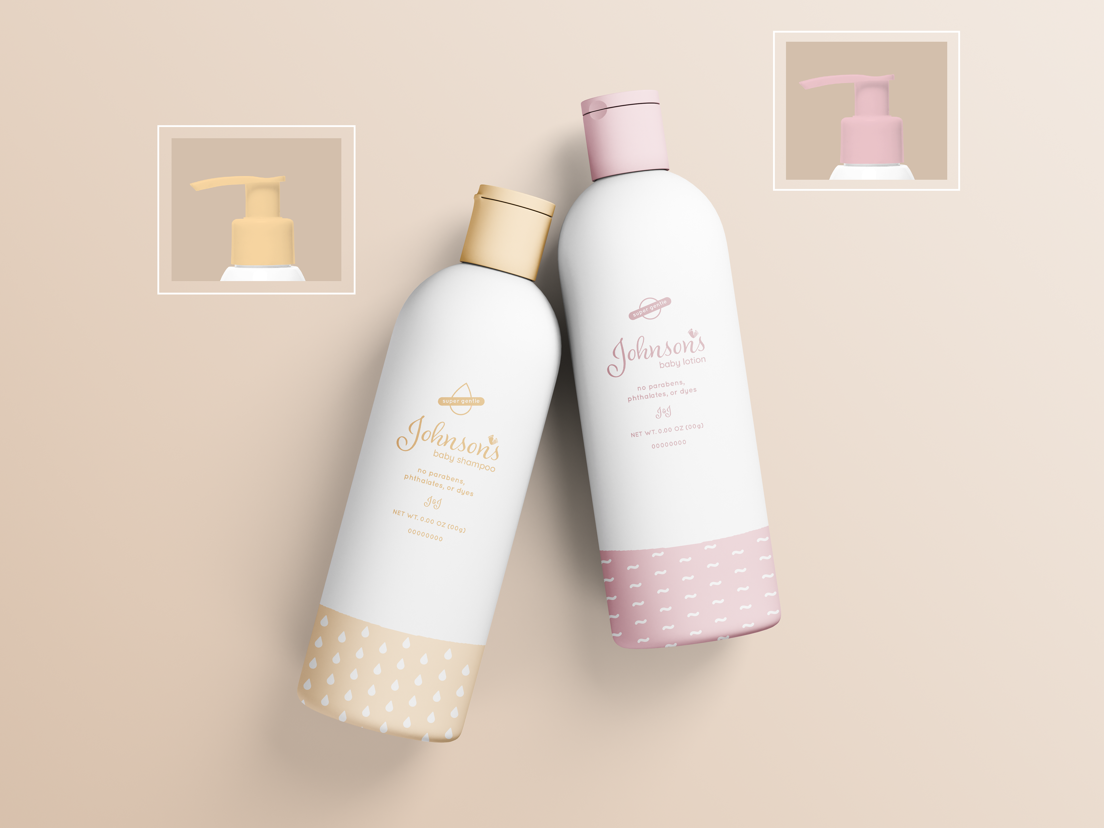
Because the branding line focuses on babies, we decided to add tiny baby feet as the apostrophe for Johnson's. It is clear that Johnson's is family friendly, clean and pure; therefore, we chose a soft pastel pallet for our color scheme, and created patterns that were suited for the product's purposes.

Baby Powder

Baby Shampoo/ Lotion Bottle


Baby Lotion Tube

Baby Soap Bar